Recently, several of us at Omnitech formed a book club to discuss Don’t Make Me Think, Revisited by Steve Krug. Since the year 2000, Don’t Make Me Think has been described as a classic web usability guide for designers and developers alike. Fast forward to 2014, the author revisits this work to examine the changes in web usability in the modern world. Our book club was diverse in perspective; Engineers, sales professionals, and our graphic designer met weekly to discuss usability philosophies. Without further ado, here are seven takeaways from our discussions that you can use to enhance your user experience.
- First Law of Usability: Don’t Make Me Think
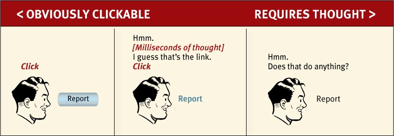
“If you have room in your head for only one usability rule, make it this one.”
As Steve Krug put it and we agreed, this ultimately shows whether a design works or it does not. The key to this point is that users do not like to figure out how to use your service. Even millisecond split decisions are distracting when trying to get a task done; a good design will be so intuitive that the user simply goes. A good design eliminates questions.
- Users Don’t Read Pages
It is important to understand the psychology behind a user’s behavior. Often, a user’s goal is to accomplish a specific task, wherein lies this disconnect: we design the site to be general purpose, yet the user has his or her own mission. Users will scan pages for the first reasonable option for whatever it is that the user wants to accomplish, rather than reading through the options and determining the best fit. Overall, it is vital that web pages be designed to be quickly scanned, which leads us to…
- Conventions Are Your Friends
Conventions are advantageous when it comes to usability, as conventions offer the user a sense of familiarity and expected behavior of a webpage. Web designers can be reluctant to use conventions, for fear of not innovating. However, web designers should be using these, unless the designer can justify the value of taking the risk. Standard conventions include things such as placement of the logo/navigation bar to the top of the screen, having visual hierarchies to distinguish information, and even simply making it obvious what’s clickable on your page. As the author puts it, innovate only when you know you have a better idea.
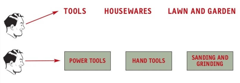
- Provide Users a Sense of Direction
The psychology of web navigation is nontrivial; it can be the difference of keeping a user or losing the user for good. This ties together with the use of conventions, in that, providing the user a sense of how to navigate across web pages is directly related to what the user is expecting. Web navigation is analogous to department store navigation, in that leaving obvious signs can help steer the user to what he or she wants to accomplish. By directing the user to expected destinations and leaving trails to show where the user is at currently, trust will be established, and the user will be more likely to leave happy.
- Enforce Usability Testing
Many people confuse Usability Testing with Focus Groups, but they serve different purposes, and each has its place. A focus group is a group of people who discuss the product in an abstract way to ensure they are making the right product. Usability Testing, on the other hand, focuses on building the product right. Usability Testing entails physically observing a user while they attempt to use your product – you see firsthand what the pain points of your interface are and how to correct them. This also takes out any guesswork about how a user might interact with your product, clearing up any misconceptions. Usability testing, in turn, leads to fewer arguments, less rework, and more time saved.
- Don’t Lose Focus of Your Page
Websites have many stakeholders from all over the business. Each stakeholder focuses on their individual business need and will request to add more information to a page. This is one of the biggest problems faced by designers and developers. While the requestors will be satisfied that their message is getting out there, all this does is obfuscate the page and distract the user. A web page should have its purpose carefully defined in the context of how it is helpful to the user.
Something like having the CEO place a message proclaiming goodwill of their company on a search result page does nothing but detract. As the designer, it falls to you to be the voice of the page. Someone needs to say, “Adding that widget will only distract the user.” You will not always be successful; there will be additions that you cannot stop, but someone needs to fight the good fight.
- Know Your Audience
This may seem to be the most obvious point, yet it is one of the more powerful things you can do. Each of the previous points deals with a common theme: What is the user thinking when they are looking at my page? Without knowing the demographics of your user, how would you predict what they want or expect? Are your users tech-savvy or perhaps near computer illiterate? Have your users seen this before, or do they even understand the intricacies of your product? Taking the time to identify the qualities and accessibility rules of your audience will ultimately lead to a more usable product.
The third edition of Don’t Make Me Think was published in 2014 and while a lot has changed in the space of technology, many of the fundamental aspects of design have remained. The cornerstone concepts of knowing your audience, utilize conventions, make pages easy to utilize, etc. are still tried and true.


